
The missing step in many user flows: what does the system do?
A user action is only the start of a flow. Explore how system outcomes, validation, permissions and state changes determine what happens next—and why making them visible leads to better design decisions.
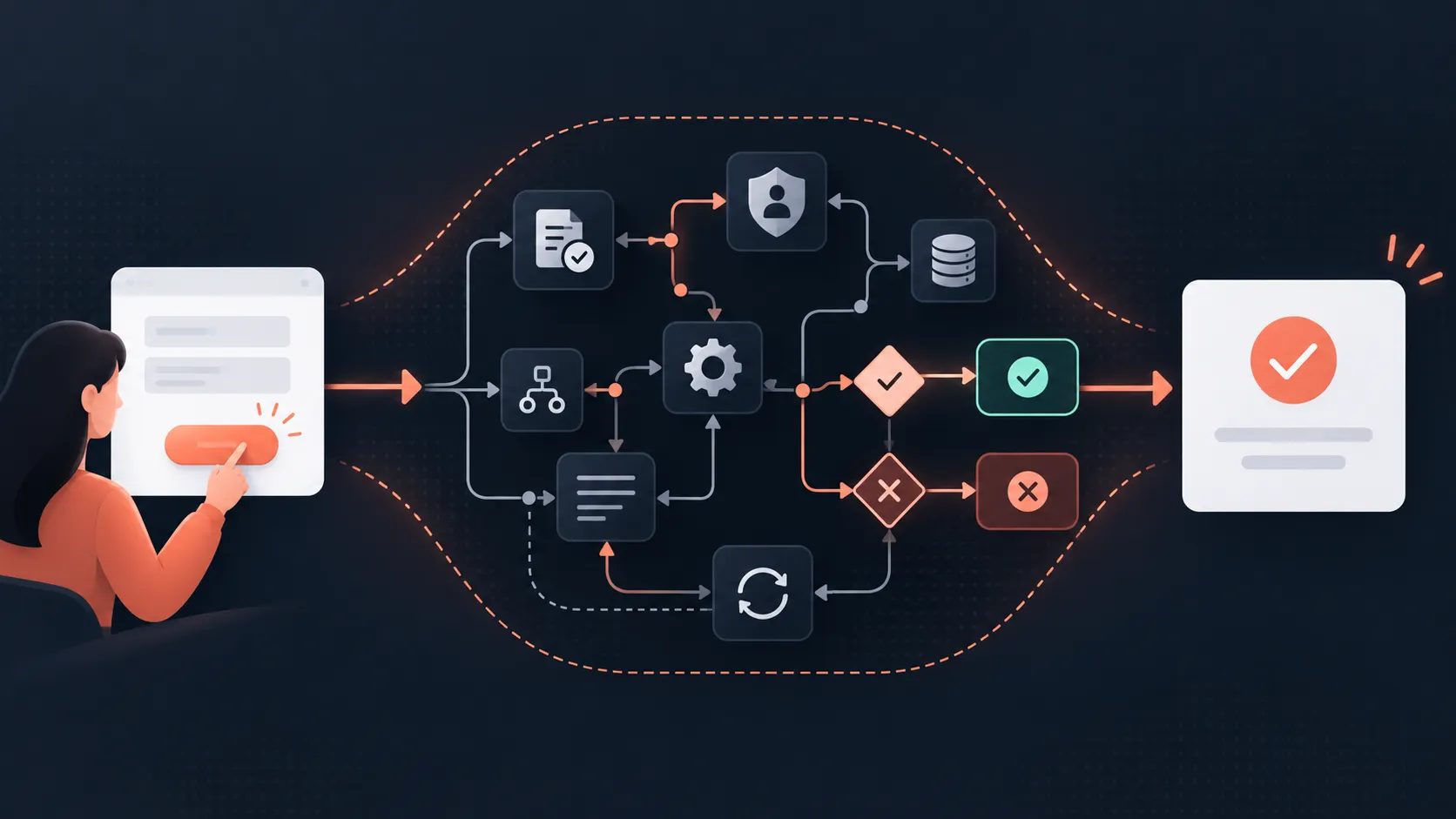
User flows tend to be very good at showing what the user does.
They select an option, enter some information, click Submit and move to the next part of the experience. If you are looking at a relatively simple flow, that may be all you need.
But on more complex products there is often something important missing between the user taking an action and whatever happens next.
What does the system do?
Take a simple example:
User submits a form → Confirmation
There is nothing obviously wrong with that flow. It tells us what the user does and where they end up.
The problem is that the arrow between those two steps could contain most of the product logic.
Before displaying the confirmation, the system might validate the information, check the user’s permissions, look for an existing record, decide whether approval is required, save the information and trigger another process.
Each of those things could also have more than one outcome.
The user action is only the start of the story.
What happens after the click?
When designing an interface, it is natural to think about actions.
What happens when the user clicks this button? Where does this link take them? What screen appears next?
Those are useful questions, but I think there is another question that needs to sit between them:
What happens in the system as a result of the action?
Imagine somebody submits an application.
A typical flow might look like:
Complete application → Submit → Confirmation
Now add one system decision:
Complete application → Submit → Is the application valid?
Suddenly there are at least two possible outcomes.
- If the information is valid, the application can continue.
- If it isn’t valid, something different needs to happen.
Now somebody asks whether every valid application can be submitted immediately or whether some require approval.
Another outcome appears.
Then someone asks whether the user has permission to submit the application in the first place.
Another decision.
None of these questions were created by making the flow more detailed. They were already part of the product. Adding the system behaviour simply made them visible.
User actions and system outcomes are different things
I find it useful to separate the action a person takes from the outcome produced by the system.
For example:
Action: User submits application
Possible system outcomes could be:
- Validation succeeds
- Validation fails
- Approval is required
- User does not have permission
- Application already exists
- System is unable to save the application
The action is the same in every case.
The outcome isn’t.
That distinction becomes particularly important when designing the interface because each outcome may require a different response.
- If validation fails, we may need to show errors and retain everything the user entered.
- If approval is required, we may need to explain what happens next.
- If the user doesn’t have permission, perhaps the Submit action shouldn’t have been available in the first place.
- If something fails technically, we need to decide whether the user can retry and whether their progress has been saved.
A single button can therefore represent considerably more product behaviour than its position on a wireframe suggests.
Outcomes aren’t just technical detail
It can be tempting to treat some of this as implementation detail that should be left to development.
There will obviously be technical decisions that don’t need to appear in a user flow. A UX designer does not need to document every database transaction or every internal API call.
But a system outcome that changes the user’s experience isn’t simply a technical concern.
- Validation is part of the experience.
- Permissions are part of the experience.
- A payment failing is part of the experience.
- An application requiring manual review is part of the experience.
- Whether somebody can edit something after it has been submitted is part of the experience.
These outcomes affect what users can see, what they can do and what they understand about the state of the product.
That makes them design decisions as much as system decisions.
Outcomes lead to state changes
The next useful question is:
What changes as a result of that outcome?
This is where I think flows become much more useful than simply showing a sequence of screens.
Take the user submitting an application example again.
Action: User submits application
Outcome: Application passes validation and is successfully submitted
State change: Application moves from Draft to Submitted
That state change may have consequences.
- The user may no longer be able to edit the application.
- It may appear in somebody else’s work queue.
- A new set of actions may become available to an assessor.
- A notification may be sent.
- The user may now see a different status when they return.
So rather than thinking only in terms of:
Screen → Screen → Screen
I prefer to think about:
Action → System Outcome → State Change
The action tells us what happened.
The outcome tells us how the system responded.
The state change tells us what is now different.
Those three things together give the team much more information about how the product needs to behave.
A login example
Login is a useful example because it looks incredibly simple at first.
Enter credentials → Login → Dashboard
But what outcomes can actually come from Login?
- The credentials might be correct.
- The password might be wrong.
- The account might be locked.
- The account might require multi-factor authentication.
- The user’s password might have expired.
- The account might no longer be active.
- The authentication service might be unavailable.
The same user action can produce several different outcomes, and each one leads to a different state and potentially a different interface.
If our flow simply says Login → Dashboard, we haven’t simplified those decisions. We have hidden them.
A payment example
Payments make the distinction even clearer.
A user selects Pay.
The obvious successful flow might be:
Pay → Payment successful → Order confirmed
But payments can fail. They can require additional authentication. They can remain pending. The payment might succeed while another part of the order process fails.
Those possibilities matter because the state of the product matters.
- If payment succeeds, can the user safely retry if the confirmation screen fails to load?
- If the payment remains pending, do we treat the order as paid?
- If payment fails, what information is retained?
- If the user returns ten minutes later, what state should they see?
These are exactly the kinds of questions that tend to appear later if the flow only records the user action.
Better conversations between disciplines
Making system outcomes visible also changes the conversation between the people involved in creating the product.
UX can think about how each outcome should be communicated to the user.
A Business Analyst can identify the business rules that determine which outcome occurs.
Product can decide which outcomes need to be supported and which might be out of scope.
Development can identify technical dependencies or conditions that affect those outcomes.
Testing can use them to identify scenarios that need to be covered.
Instead of each discipline discovering a different part of the logic through its own artefacts, the flow gives everybody somewhere to discuss it together.
This is one of the reasons I think user flows are most valuable when they are created before detailed wireframes. I wrote more about that in When is the right time to do your user flows?.
The earlier these outcomes become visible, the easier it is to decide what the product should actually do before everybody starts designing, building and testing their own interpretation of it.
Does every system outcome need to be shown?
No.
There is always a balance.
If you try to model every internal process, every technical response and every unlikely exception, the user flow can become so complicated that nobody wants to use it.
The point isn’t to turn a UX artefact into a technical architecture diagram.
The point is to identify the system outcomes that materially affect the experience or the product state.
A useful test is to ask:
If this outcome were different, would the user see something different, be able to do something different or leave the product in a different state?
If the answer is yes, it is probably worth considering in the flow.
If the answer is no, the detail may be better represented somewhere else.
Try it on an existing flow
Take an existing user flow and pick one action.
Preferably something that currently has a nice straight arrow going from the action to the next step.
Now ask:
What does the system need to decide or do before we can move to that next step?
Then ask:
What other outcomes are possible?
Finally:
What changes after each outcome?
You might end up with something as simple as:
User submits form
→ Validation succeeds and submission succeeds
→ Form becomes Submitted
and:
User submits form
→ Validation fails
→ Form remains Draft
That isn’t dramatically more complicated than the original flow.
But it tells us considerably more about the product.
It also gives the team something useful to challenge. What causes validation to fail? Can a submitted form be edited? What does the user see in each state? Are there other possible outcomes?
Those questions are where much of the real product design happens.
The missing middle
When a user flow jumps directly from a user action to the next screen, there is often an assumption hidden inside the arrow:
Everything needed for us to get there happens successfully.
Sometimes that assumption is perfectly reasonable.
On complex products, it often isn’t.
By making the system outcome visible, we create a space to discuss validation, permissions, business rules, failures, approvals and all the other things that determine how the product actually behaves.
The aim isn’t to make user flows more complicated for the sake of it.
It is to make the important complexity visible while there is still time to do something useful with it.
So the next time you see:
User action → Next screen
try adding one question in the middle:
What does the system do?
You may be surprised by how much of the product is hiding inside that arrow.