
Why user flows hide product complexity
User flows can make complex products look deceptively simple. Explore how validation, permissions, branching decisions, errors and state changes get hidden—and how to make them visible.
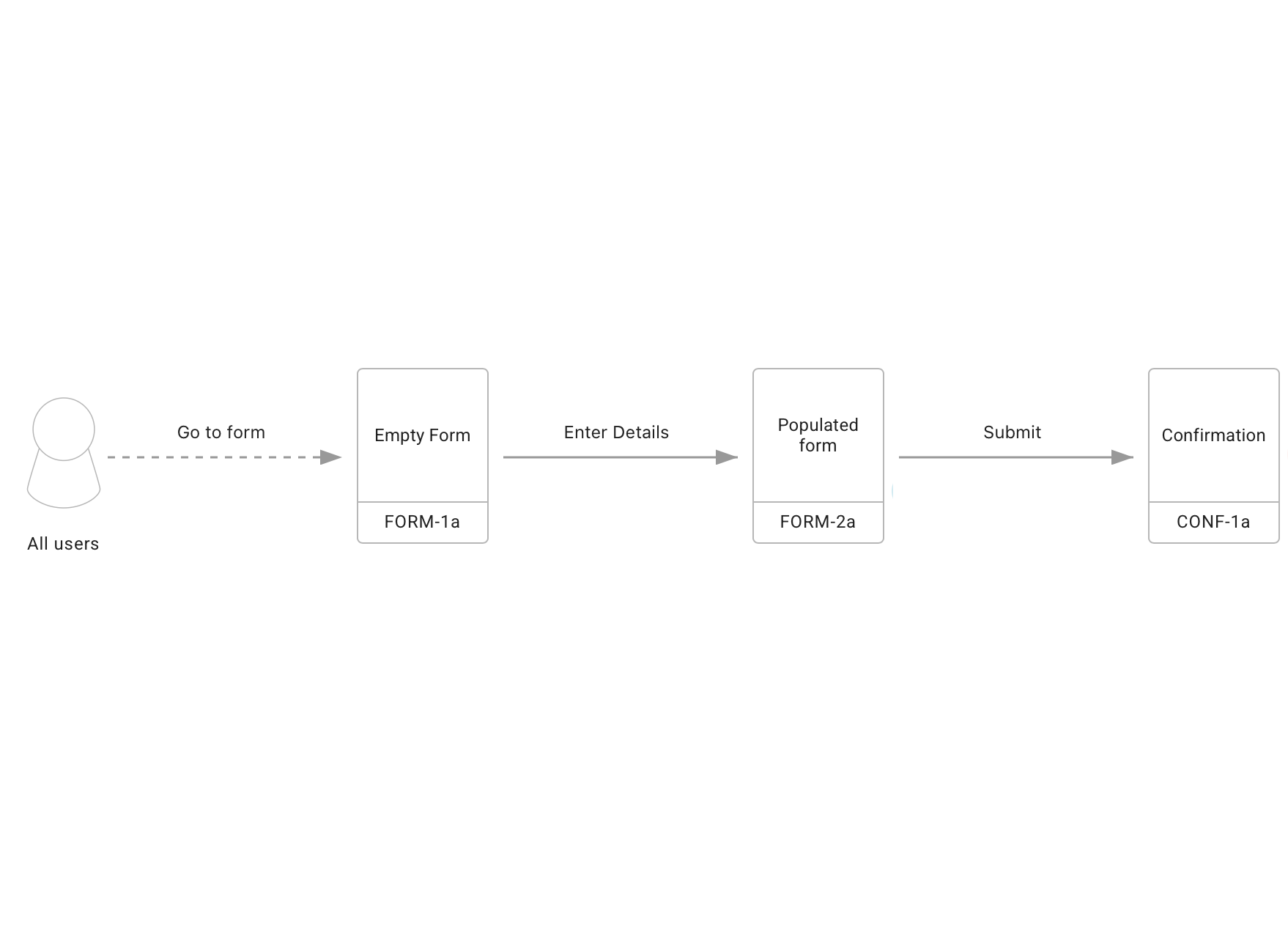
User flows are a useful way of showing how someone moves through a product or service, what actions they take and where those actions lead.
However, when a user flow only represents the ideal journey, it can make a product appear simpler than it really is. Validation rules, permissions, alternative outcomes, failures and state changes can remain hidden, even though they determine how the product actually needs to behave.
The problem is that user flows are often simplified to the point where they only represent the ideal journey. They show the user entering some information, selecting an option, submitting something and eventually arriving at a successful outcome. This makes the flow easy to understand, but it can also hide a significant amount of the product logic that sits underneath it.
Take a very simple example:
Enter details → Submit → Confirmation

There is nothing particularly wrong with this flow. If you are initially trying to understand the main path through a product, it is probably a sensible place to start. But it makes a number of assumptions about what happens during that journey.
The information entered by the user is valid. The user has permission to perform the action. The system is available. The information can be saved. Nothing else needs to happen before the confirmation is displayed.
As soon as one of those assumptions is wrong, the flow starts to become more complicated.
The happy path
The happy path is normally the easiest part of a product to map. It represents what happens when the user does everything expected of them and the system behaves exactly as expected.
There is nothing wrong with designing the happy path. In fact, I normally think it is a good place to begin because it allows you to understand the basic structure of the journey before adding complexity.
The problem comes when the happy path becomes the entire user flow.
For instance, go back to our simple form example. What happens if the user hasn’t completed a mandatory field? What happens if an email address isn’t valid? What if the information they are entering already exists? What if they have permission to view the form but not submit it? What if the system is temporarily unavailable?
Each of these introduces another possible outcome. Some of those outcomes may return the user to the same place, some may move them somewhere else and some may change what the user is allowed to do next.
The original three-step flow is still useful, but it doesn’t tell us very much about how the product actually needs to behave.
A lot happens between the boxes
User flows naturally encourage us to focus on the boxes. A user performs an action in one box and then follows an arrow to another box.
Quite often, the interesting part is actually what happens inside the arrow.
Consider:
Submit → Confirmation
Before the confirmation is displayed, the system might validate the information, check the user’s permissions, check for an existing record, save the new information, update another system and send a notification.
Some of those activities may also have multiple outcomes. Validation can pass or fail. A record can be saved or an error can occur. Another system might respond immediately, respond slowly or not respond at all.
If all of this is represented by a single arrow between Submit and Confirmation, the user flow looks very clean. Unfortunately, the product isn’t necessarily as clean as the diagram.
This is where complexity can become hidden rather than removed.
Decisions create more than another path
Decisions are another area where user flows can become misleading.
Let’s say the system checks whether the information entered by the user is valid. At first this looks like a straightforward yes/no decision.
If the information is valid, continue to the next step.
If the information isn’t valid, return the user to the form.
But what does returning the user to the form actually mean? Do they keep the information they have already entered? Are all the validation messages displayed at once or only one at a time? Does the user need to correct the error before doing anything else? What happens when they submit the form again?
A single decision can therefore introduce several different interface and system states.
Add permissions, payment outcomes, account status, availability or any other business rule and the number of possible states grows very quickly.
This doesn’t mean every one of these possibilities needs its own enormous section of a flow diagram. It does mean the team needs some way of understanding that they exist.
State changes are often missing
One of the biggest things I think user flows frequently miss is the change in state caused by an action.
For example, imagine a user is reviewing a request and selects Approve.
A simple flow might be:
Review request → Approve → Confirmation
From the user’s perspective, they have moved from one screen to another. From the product’s perspective, considerably more may have happened.
The request might now have an Approved status. It might no longer be editable. It may disappear from one person’s work queue and appear in another person’s. Another role may now have permission to perform the next action. A notification may have been sent.
The important part of the interaction isn’t necessarily that the user moved to a confirmation screen. The important part may be that the state of the product has changed.
If we only map screen-to-screen navigation, that information is very easy to lose.
Are edge cases really edge cases?
Another common approach is to map the main flow and leave the edge cases until later.
Again, there are good reasons for doing this. Trying to account for every possible situation at the start of a project can create a diagram that nobody can understand.
But I think we sometimes use the term edge case for things that aren’t particularly unusual.
A user entering incorrect information into a form isn’t an edge case.
A payment being declined isn’t an edge case in a payment process.
Someone forgetting their password isn’t an edge case in a login process.
A person leaving a task halfway through and returning later isn’t necessarily an edge case either.
These situations may not form part of the happy path, but they are still normal parts of the user experience.
The question shouldn’t really be whether we include every possible exception. It should be whether the exceptions that materially affect the experience have been considered.
The answer isn’t bigger diagrams
At this point it would be easy to conclude that a good user flow should contain every business rule, system response and possible exception.
I don’t think that’s the answer either.
A user flow that tries to represent absolutely everything will quickly become unusable. You end up with a huge diagram, lines crossing everywhere and a team that stops looking at it because finding anything takes too much effort.
The purpose of a user flow is still to simplify.
The important distinction is between simplifying complexity and hiding complexity.
Simplifying means representing the important parts of a complicated product in a way that the team can understand.
Hiding means leaving something out of the model even though somebody will eventually need to make a decision about it.
Those decisions don’t disappear because they aren’t on the diagram. They simply appear later.
A designer discovers the missing validation state while creating wireframes. A developer asks what should happen when an API call fails. A tester discovers that a user can return to the process in a state nobody has considered.
At that point the team has to go back and make a decision that could have been made much earlier.
A simple way to review an existing flow
You don’t necessarily need a new methodology to improve an existing user flow.
Take one of the actions in the middle of the flow and ask:
What decisions need to happen after this action?
What outcomes are possible?
What changes as a result?
What happens if it doesn’t work?
You may decide that some of the answers aren’t important enough to add to the diagram. That’s fine. The value is in making the decision consciously rather than assuming the arrow between two boxes explains everything.
For me, this is one of the most useful purposes of a user flow. It isn’t simply a picture showing how someone gets from the beginning of a process to the end. It is a tool for helping a team understand how the product needs to behave along the way.
Complexity isn’t necessarily a problem.
Complexity that nobody can see is.