
Why do we start drawing screens before we understand what they need to do?
Wireframes make progress visible, but designing screens too early can hide unresolved product logic. Explore how decisions, failures and state changes can create rework when discovered too late.
There is something reassuring about a wireframe.
A blank page or an unresolved process can feel vague, but as soon as someone puts a screen in front of the team there is something tangible to react to. People can point at it, discuss the fields, move things around and start imagining how the finished product might work.
That makes wireframes an incredibly useful design tool, but I also think it creates a temptation to start designing screens before we have properly understood what those screens need to do.
I have seen plenty of projects where the team moves quite quickly from discovery into wireframes. The first screens look sensible, everyone feels like progress is being made, and then the questions start appearing.
What happens if this information isn’t valid? What happens if the user isn’t allowed to perform this action? Does the system automatically approve this, or does somebody need to review it? What happens if the request fails? What does the user see when they return tomorrow?
None of these are really questions about what the screen looks like. They are questions about how the product works.
Why screens feel like progress
Product development involves a lot of activities that don’t immediately produce something visible. Research, analysis, workshops, requirements discussions and conversations about business rules can all be essential, but their progress can sometimes be difficult to see.
Wireframes are different.
Within a relatively short period of time you can have something that resembles a product. Stakeholders can see it. Developers can start thinking about how it might be built. Researchers can put it in front of users. Product Owners can begin imagining the feature appearing in the backlog.
This tangibility is useful, but it can also create a false sense that decisions have already been made.
Once a screen exists, conversations naturally become anchored around it. Should this field be mandatory? Should these two sections be on the same page? Should we use a dropdown or radio buttons? Do we need a Back button?
Again, these aren’t bad questions. They need to be answered at some point.
The problem is when we are discussing the controls on the screen while the team still doesn’t agree on what should happen when the user selects them.
A screen doesn’t tell you what the system does
Imagine we are designing a fairly standard approval process. Someone completes a request and submits it for approval.
It would be easy to start producing wireframes for:
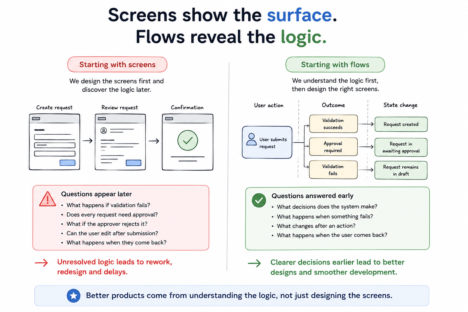
Create request → Review request → Submit → Confirmation
From an interface perspective, there is plenty to work with. We can decide what information needs to be entered, how the review screen should be structured and what the confirmation should say.
But before getting very far, I would want to understand considerably more about the product logic.
Who is allowed to submit the request? Does every request require approval? Who approves it? What determines which approver receives it? Can there be more than one approver? What happens if it is rejected? Can the requester change it after submission? Can an approver send it back for more information? What happens if the requester leaves the organisation while the request is waiting for approval?
Depending on the service, there may be ten more questions after those.
The wireframes aren’t going to answer them for us.
They may help expose some of the questions, but if we discover the logic by repeatedly changing the screens, we are using the wireframes as an analysis tool after we have already started treating them as a design solution.
What decisions does the system make?
A lot of digital products contain decisions that the user never explicitly sees.
A user clicks Submit and the system checks whether the information is complete. It might check a business rule, look at the user’s permissions, compare something against existing data or call another service before deciding what happens next.
The interface may only contain one button, but the action behind that button could have several possible outcomes.
This is one of the reasons I think it is useful to separate the user action from the system outcome when thinking through a product.
Instead of:
Submit → Confirmation
we might discover that the underlying logic is closer to:
Submit → Validation successful → Request created
or:
Submit → Validation failed → Request remains in draft
or:
Submit → Approval required → Request moves to awaiting approval
The screens can still be relatively simple. The important point is that we understand the different behaviours the interface needs to support before deciding exactly how to represent them.
What happens when something fails?
Failure states are another area that often appears later than it should.
When we first imagine an experience, we naturally imagine it working. The user enters the right information, the connection remains available, the external service responds and the data saves correctly.
Unfortunately, that isn’t always the experience users get.
If a save fails, what happens to the information the user has entered? If an external service times out, can they retry? If something partially completes, does the system roll it back or leave the product in a different state? If the user loses their connection halfway through an action, what will they see when they return?
These aren’t necessarily technical edge cases that can be handed to development later. They can have a significant impact on the user experience and may require completely different interface states.
If we wait until the wireframes are already well developed before answering these questions, we can end up redesigning screens that were perfectly good representations of a product that didn’t actually exist.
What changes after an action?
Another useful question is simply:
What is different after the user does this?
Sometimes the answer is obvious. A user deletes an item and the item no longer exists.
Often it is more complicated.
Approving something might change its status, remove the ability to edit it, make another action available to a different user and trigger a notification. Completing a payment might activate a subscription, create an invoice and change what parts of the application the user can access.
The interface shown immediately afterwards is only one representation of those changes.
If we focus entirely on screens, it is easy to think of the experience as a sequence of pages rather than a sequence of actions that cause changes to the product.
Understanding those state changes before wireframing gives the designer much better information about what needs to be represented. It also gives developers, BAs and Product Owners something concrete to challenge before implementation starts.
What happens when the user comes back?
Products don’t always get used in one continuous session.
Someone might start an application on Monday and return to it on Friday. A request may sit with another person for three days before being approved. A payment may fail and be retried later. An administrator may change a user’s permissions while they are halfway through a process.
When the user comes back, what state is the product in?
This question is particularly easy to miss when designing screens sequentially because the wireframes encourage us to imagine the user moving directly from one screen to the next.
Real usage often doesn’t happen like that.
Understanding what is saved, what remains available and what can change while the user is away can significantly affect the interface. These are decisions that are much easier to work through while discussing the product logic than after dozens of wireframes have already been created.
Unresolved logic creates repeated design
None of this means the initial wireframes will be wasted. Design is iterative and we should expect interfaces to change as we learn more.
The issue is the type of change.
Changing a screen because user testing shows that the hierarchy is confusing is useful iteration. Changing a screen because the team has only just discovered that there are three possible outcomes from an action is something different.
The first is learning through design.
The second is discovering requirements while trying to design them.
That distinction matters because unresolved logic can cause changes to spread through multiple screens. A new permission rule might affect navigation, available actions, empty states and error handling. A new approval outcome could introduce another screen, another status and another pathway through the product.
One unresolved decision can create a surprising amount of rework once detailed design is underway.
This isn’t an argument for big upfront specifications
There is an obvious danger with this argument.
If we shouldn’t start wireframing until we understand the product logic, does that mean we need to document every requirement, exception, business rule and system interaction before design begins?
Definitely not.
I spent enough of my career around large delivery environments to know what happens when analysis becomes an attempt to eliminate every unknown before anybody is allowed to design or build anything.
You don’t need a 200-page specification before opening Figma.
The goal is not to know everything. The goal is to understand enough of the important logic that the screens aren’t being designed around assumptions nobody has discussed.
There will always be questions discovered during wireframing. There should be. Looking at an interface exposes things that are difficult to see in an abstract model, just as usability testing exposes things that are difficult to see in a wireframe.
The important thing is to avoid using screen design as the first place where the team attempts to understand how the product behaves.
So how much should we know first?
There isn’t a universal checklist because the amount of analysis needed depends on the product.
A simple marketing signup form doesn’t need the same level of modelling as a government application, banking process or enterprise approval workflow.
Before moving too far into screens, though, I would normally want the team to have a reasonable understanding of a few things.
What actions can the user take? What are the important decisions? What outcomes can those actions create? What happens when something fails? Are permissions involved? What important states can the product be in, and what causes it to move between them?
Most importantly, are there significant questions about any of those things that nobody can currently answer?
If there are, that isn’t necessarily a reason to stop the project. It is a reason to get the right people together and work through them.
This is where an early user flow can be particularly useful. Rather than documenting screens that already exist, the flow becomes a way for UX, BA, Product, Development and other disciplines to discuss what needs to happen before any one discipline gets too far ahead.
I wrote more about where I think user flows should sit in the wider design and development process in When is the right time to do your user flows?. The important point is that the flow shouldn’t be something created after the wireframes to explain the design. It should start earlier, then continue to evolve alongside the wireframes, development and testing.
The aim is better conversations earlier
I don’t think the answer is to put another stage gate in front of design.
The answer is to have the product conversation before the screen conversation takes over.
Start with what the user is trying to achieve. Map the important actions. Understand what the system needs to do in response. Identify the outcomes and the significant state changes. Find the areas where different people have different assumptions.
Then start designing how those things should be experienced.
The flow and the wireframes can continue to evolve together from that point. New questions will appear during design, testing and development, and the underlying logic should be updated as they are resolved.
But the team is starting from a shared understanding of what the product needs to do rather than hoping the screens will eventually tell them.
Wireframes are excellent at answering:
What should the user see and interact with?
Before we ask that question, I think we need to spend a little more time answering:
What actually needs to happen?